Over the years, luxury fashion, jewellery, automotive, hospitality and watch brands have become identified with certain symbols, earning an unforgettable place in their customers’ minds. These symbols may be the emotional impact of a distinctive shade of colour, the craftsmanship embedded in a product’s form, or a logo or motif that makes the brand’s presence felt without its name being spoken. In the world of luxury, such symbols are not accidental; they are strategic signatures, meticulously protected to make the brand’s memory, heritage and character visible.
A luxury brand’s symbol is not just a visual cue that provides recognition; it is also a powerful reminder that evokes a feeling about the brand in the customer’s mind. A Tiffany blue box, Rolls-Royce’s Spirit of Ecstasy figurine, Hermès’s orange packaging or Chanel’s white camellia… Each of these elements conveys the brand’s history, values and even its promise to the customer at a single glance. What builds the perception of luxury is often not glitter but the consistency, ritualised experience and depth these symbols create.
Brands create their own universes by using these symbols not merely as aesthetic elements but resolutely across every touchpoint, from store atmosphere and packaging design to advertising language and product development. Over the years, these symbols create a sense of belonging in the customer’s mind and become a collective memory woven into the fabric of the brand.
That is why luxury symbols are so important as the most visible and most moving reflections of a brand’s DNA. Each carries a silent story that tells of the brand’s identity, a character you can feel when you touch it, and a meaning that becomes an experience.
Tiffany & Co. – Tiffany Blue and the Iconic Blue Box:
Tiffany & Co. is identified with the legendary Tiffany blue chosen by its founder Charles Lewis Tiffany and the little blue boxes it adorns. This special shade of robin’s-egg blue, registered as “Tiffany Blue”, first appeared in shop windows in the 19th century and became the signature of the Tiffany brand, associated with elegance and exclusivity. A newspaper in 1906 even wrote that Tiffany’s blue box could not be bought for money and was given only with a product purchased in the store. Indeed, by never allowing these boxes bearing its name to be sold, Tiffany turned the box itself into a symbol of privilege. The rule still applies today, keeping the blue box unattainable and desirable and sustaining the brand’s image of exclusivity.

Tiffany blue is so deeply ingrained in the brand’s identity that Tiffany & Co. registered the colour as a trademark in the US in 1998 and had it standardised as a custom shade in the Pantone system in 2001 (Pantone 1837, in honour of the company’s founding year). Today Tiffany blue is used consistently everywhere, from store décor to advertising campaigns and even jewellery designs. Products are presented in a Tiffany blue box tied with a white ribbon, reinforcing the magic of receiving a gift from Tiffany. Around this colour, the brand names its annual high jewellery collection the “Blue Book” and even runs a café decorated in shades of Tiffany blue, the “Blue Box Cafe”, in its flagship store in New York. In the end, Tiffany blue is not just a colour; it has become a promise that a gift from Tiffany will always bring joy.
Hermès – Orange Boxes and Carré Silk Scarves:
The first thing that comes to mind with Hermès is its vivid Hermès orange. During the Second World War, the famous fashion house was forced to make its boxes from orange cardboard because of a shortage of packaging materials, but this “lucky” choice gradually became Hermès’s signature. Since the 1940s, Hermès orange boxes, tied with a brown ribbon, have accompanied every one of the brand’s products as a source of pride. In the 1950s the brand’s historic horse-drawn carriage logo was added to the boxes, so that Hermès’s craftsmanship heritage was embodied in the box design. Today Hermès’s vivid orange is a brand symbol of luxury and modernity that cannot be confused with any other shade.

These boxes are so prestigious that among Hermès customers even collecting them is considered a status symbol; the iconic orange box has become a symbol expressing the privilege of owning Hermès.
Another iconic Hermès symbol is the square silk scarf known as the “carré”. First produced in 1937, these 90×90 cm scarves are known for patterns referencing the brand’s long equestrian heritage and for their superb craftsmanship. To date, Hermès has worked with more than 150 artists to design silk scarves in hundreds of different patterns and has released over 2,000 designs. Over the years the scarves have been worn by many iconic figures, from Grace Kelly to Queen Elizabeth; when Grace Kelly injured her arm in 1956, for example, she was photographed using a Hermès scarf as a sling. In French culture these scarves have become heirlooms and collector’s items passed down from generation to generation. To keep this heritage alive, Hermès has periodically introduced the art of tying scarves to younger generations through pop-up events such as the “Hermès Carré Club”, and repositioned the scarf as part of modern style with its “J’aime mon carré” campaign. In short, by bringing together the exclusivity of its orange boxes and the artistry of its silk carrés, Hermès has created symbols that reflect its brand values in both packaging and product.
Chanel – The Camellia and the Rise of the 2.55 Bag:
Foremost among Chanel’s symbols is the white camellia, which became the personal signature of founder Coco Chanel. Coco Chanel saw this scentless, elegant flower as a symbol of simplicity and sophisticated beauty, and from the 1910s onwards began working the camellia motif into her clothes and accessories. Over time the camellia came to signify “timeless elegance and femininity” in the Chanel universe. Today the white camellia appears in every Chanel boutique and on its packaging: Chanel purchases are wrapped in boxes adorned with the iconic white camellia. Made from fine fabric, each of these camellia decorations is made by hand and takes about 40 minutes to complete — a detail that reflects Chanel’s passion for perfection. The brand has also made the flower an inspiration for its creative designs, releasing high jewellery collections called Camélia. The camellia is as much a tribute to Chanel’s past (to La Dame aux Camélias, which Coco Chanel read in her youth, and to her memories of her lover Boy Capel) as it is a symbol of the brand’s time-defying feminine aesthetic.

Another Chanel classic is the 2.55 shoulder bag.
Designed by Coco Chanel in February 1955 (hence its name), this quilted leather bag with its gold chain strap revolutionised the hand-held bags of the era. Reflecting Chanel’s free-spirited vision, the 2.55 gave women the freedom to carry a bag without using their hands, bringing together functionality and chic.
The bag’s quilted pattern references Chanel’s equestrian-inspired aesthetic, while its seven inner pockets were designed so that Coco could keep her lipstick and private letters in them. Every detail holds a story. The original 2.55 clasp was a plain rectangle; in the 1980s Karl Lagerfeld updated it with the double “C” logo, creating the “Classic Flap”. This bag and its variations feature in Chanel’s campaigns almost every season and are presented as “forever modern”. In 2021, for example, Chanel highlighted the timeless appeal of its flap bags with an advertising campaign called “The Chanel Iconic”, starring models such as Rianne Van Rompaey and Imaan Hammam. The 2.55 and its variations remain iconic accessories that symbolise Chanel’s heritage and innovative spirit and hold a privileged place in fashion lovers’ wardrobes.
Rolls-Royce – The Spirit of Ecstasy:
The century-old symbol of Rolls-Royce cars is the figurine called the “Spirit of Ecstasy”, rising proudly above the front grille of every car. Adorning every Rolls-Royce produced since 1911, this miniature sculpture depicts a woman in flight, leaning into the wind with her arms swept back. The brand’s founders wanted the mascot to reflect the “spirit” of Rolls-Royce; Claude Johnson, the managing director at the time, said the sculpture should represent “speed with silence, the mysterious harnessing of great energy and a beautiful living organism of superb grace”. Indeed, the Spirit of Ecstasy is a figure that embodies the silent power and elegance of Rolls-Royce’s engineering masterpieces.
According to legend, the figurine was inspired by the secret love affair between the English aristocrat Lord Montagu and his mistress Eleanor Thornton. It is said to represent the spirit of Thornton, who modelled for the sculpture. Although the details of this love story have been debated over time, it adds romance and mystery to the brand’s narrative.
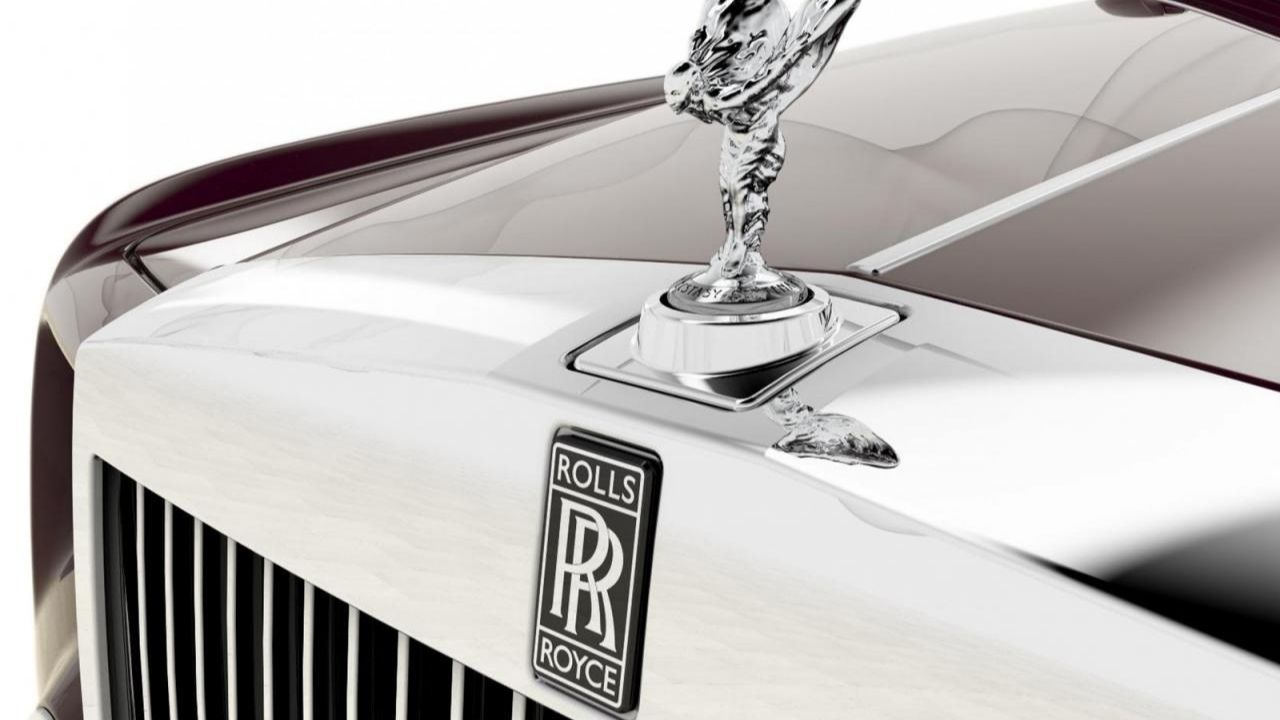
Today the Spirit of Ecstasy is like a globally recognised seal of Rolls-Royce. Every Rolls-Royce is delivered crowned with this figure, and on modern models the figurine even retracts automatically into the car when parked to protect it. To underline the importance of the symbol, Rolls-Royce celebrated the mascot’s 100th anniversary in 2011 with special events.
For example, an exhibition of 100 portraits by the famous photographer Rankin, inspired by the Spirit of Ecstasy, was shown in Rolls-Royce showrooms around the world.
In 2022, when introducing its new fully electric model, the brand also reinterpreted the figurine’s form aerodynamically, bringing past and future together. Also known as the “Flying Lady”, the sculpture symbolises Rolls-Royce’s principle of staying true to its essence despite changing times; in the words of CEO Torsten Müller-Ötvös, “although it has evolved continuously for more than a century, it has always remained true to the spirit that inspired it”. Today the Spirit of Ecstasy is regarded not just as a car ornament but as a worldwide symbol of luxury, splendour and engineering excellence.
Rolex – The Crown Logo and the Oyster Case:
Rolex is known for its five-pointed crown logo, a symbol that has almost overtaken its name. Developed a few decades after the brand registered the name Rolex in 1908, this gold crown emblem expresses Rolex’s position as “king” of the watch world. The crown logo was designed to evoke superior quality, prestige and achievement; indeed, for many years Rolex has positioned itself as a symbol of achievement in fields from sport to the arts with the slogan “A crown for every achievement”. The brand’s gold-and-green logo reinforces connotations of wealth and splendour. Today Rolex’s logo is as recognisable as its watches. The small crown at the 12 o’clock position on the dial is like a silent promise of quality between the brand and the customer. By proudly displaying the crown at the events it sponsors, from the Wimbledon tennis championships to yacht races, Rolex has made it a universal symbol of elitism.
Another innovation that made Rolex legendary is the waterproof watch case it named the Oyster. Introduced in 1926, the Rolex Oyster broke new ground in watchmaking history as the world’s first truly water- and dust-proof wristwatch case. Founder Hans Wilsdorf named the case after the oyster, explaining: “just as an oyster seals itself shut underwater to protect itself, the Rolex Oyster protects its inner mechanism from external factors”. Thanks to the Oyster case’s unique screw-down caseback, bezel and winding crown, the watches achieved water resistance unprecedented at the time.

To prove the Oyster’s durability, in 1927 Rolex had the British swimmer Mercedes Gleitze wear a Rolex Oyster while swimming the English Channel; despite spending more than 10 hours in the cold sea, the watch kept working, and the feat was announced in newspaper headlines the next day as “The Wonder Watch that Defies the Elements”. Rolex then introduced this technical marvel to a wide audience by displaying Oyster watches submerged in aquariums in London shop windows.
This innovation became the symbol of Rolex’s legacy of innovation. Today almost every classic model bears the words “Oyster Perpetual” in its name, a symbolic reminder of Rolex’s promise of reliability that defies water and time. Considering the crown logo and the Oyster case together, we can say that Rolex is identified both with achievement and splendour and with technical excellence and durability — a combination that has given the brand a unique position in watchmaking.
Bvlgari – The Serpenti (Snake) Motif:
Bvlgari is identified with the snake figure (Serpenti) used in its designs. Regarded in Ancient Greece and Rome as a symbol of wisdom, rebirth and vitality, the snake carries similar meanings for Bvlgari. In the late 1940s, Bvlgari became one of the first brands to adapt this ancient motif to modern jewellery with bracelet-watch designs coiled in the form of a snake. The Italian jewellery house achieved great success with snake watches that wound around the wrist as gold Tubogas bracelets; in the 1960s, its snake necklaces and bracelets with realistic enamel work were worn by stars such as Elizabeth Taylor, inspiring collectors. A wide range of products developed in which the snake motif was used even on leather bag clasps and spectacle arms. Over the years Bvlgari has continuously evolved the Serpenti collection, making it a symbol of the brand’s philosophy of “transformation and reinvention”. Its design directors underline the meaning of Serpenti: “For me, the snake means metamorphosis — the ability to change and adapt.”

Today Bvlgari’s snake symbol is seen as part of the brand’s DNA. The brand celebrated the Year of the Snake in the Chinese calendar in 2018 with “Serpenti Form” exhibitions and limited-edition pieces, and in 2025, as the Year of the Snake approached in Asia, it launched a global campaign called “Serpenti Infinito”. With this campaign Bvlgari aimed to position the snake motif as a universal symbol of unity and renewal, presenting new jewellery, watches and leather goods around this theme.
In every era, Serpenti designs have reflected Bvlgari’s reputation for bold use of colour, combining different materials and superior goldsmithing techniques. In the brand’s high jewellery collections, for example, snake necklaces set with diamonds and precious stones are true masterpieces. In short, Bvlgari has built a world around the Serpenti motif that both embraces cultural heritage and appeals to contemporary aesthetics. The snake has become an icon symbolising the essence of Bvlgari’s bold, seductive and immortal style.
Louis Vuitton – The Monogram Pattern:
Louis Vuitton is famous for its monogram pattern featuring the letters “LV” and floral motifs — one of the most recognised brand motifs in the world. Created in 1896 by the founder’s son, Georges Vuitton, this beige-on-brown monogram canvas both immortalised the name of his father, Louis Vuitton, and was designed as a measure against counterfeiting. In the more than a century since, the Louis Vuitton Monogram has become almost synonymous with luxury and exclusivity. Bearing the stylised “LV” letters, the pattern reflects the brand’s long heritage and passion for quality. When it first appeared, the monogram canvas adorned the travel trunks of aristocrats; today it is used across Vuitton’s wide range, from bags and wallets to suitcases and accessories. Products such as the iconic trunks finished with fine handcraftsmanship and the classic monogrammed “Speedy” handbag have gained global popularity as status symbols.
The monogram’s success lies in Louis Vuitton’s strategy of using it in ways that both preserve tradition and innovate. Over the years the brand has kept the monogram fresh through countless special collections and collaborations. In 2003, for example, Japanese artist Takashi Murakami reinterpreted the monogram with colourful, cartoon-inspired figures, creating a series that captivated the younger generation.

In 2012, artist Yayoi Kusama added her famous polka dots to the monogram in a striking collaboration that extended from shop windows to product designs. The streetwear-influenced collection with Supreme in 2017 proved once again what a cultural phenomenon the monogram is. Through these campaigns, Louis Vuitton worked with the world’s leading contemporary artists and designers, turning the monogram into a canvas for modern art without severing it from its Parisian fashion-house roots. In the brand’s stores, especially pop-up concept boutiques, giant installations or graphic elements of the monogram greet customers, turning brand perception into a spatial experience.
In short, the Louis Vuitton monogram holds an unrivalled place in fashion history, both as a coat of arms representing the brand’s heritage and as a constantly renewed design element.
Burberry – The Check Pattern:
Burberry is associated with its beige, black, white and red check pattern (the Burberry Check), which has become a symbol of British fashion. First seen in the lining of Burberry trench coats in the 1920s, this tartan pattern became the brand’s distinctive visual identity from the mid-20th century. The Burberry check is valued as a symbol reflecting English elegance and the brand’s long heritage, evoking a dapper gentleman or an elegant lady strolling through Britain’s rainy streets.
Although the pattern was used sparingly in its early years, in 1967 a trench coat with a check lining was displayed turned inside out in a Burberry shop window in Paris, and following strong customer demand the check moved to the outer surface of many products, from umbrellas to luggage. Over time this classic beige check appeared on a wide range of products, including foulards, scarves, bags, shoes and even home textiles, strengthening Burberry’s consistent brand image. Because the design is a memorable identity element, it works as a brand signature that evokes Burberry at a glance.

But the history of the Burberry check is not a straightforward success story. In the late 1990s and early 2000s the pattern became so popular that it was overused on counterfeit products. This period threatened to erode the brand’s image, and Burberry’s management changed strategy, deciding to reduce the visibility of the check.
Under the leadership of Angela Ahrendts and Christopher Bailey, licensing agreements were reviewed and the check began to be used only on select, limited pieces. This preserved the pattern’s former glory and prevented it from spreading cheaply to the masses. In the 2010s the Burberry check was made a status symbol again by featuring it on the brand’s core products, notably cashmere scarves and the lining of classic trench coats. In 2017, for example, the brand’s creative director Christopher Bailey presented a special collection adding rainbow colours to the check to show support for the LGBT community, and this bold interpretation was widely praised. Today the creative team adapts the traditional check to modern fashion by reinterpreting it in different colours and scales, while continuing to convey the brand’s British heritage and message of permanence through this symbol. The Burberry check is a textbook example of adaptation and continuity in fashion: it successfully sustains the cultural resonance of its homeland (England) in the global luxury market.
Ritz Paris – Blue & Gold and the Historic Entrance:
Ritz Paris brings to mind the elegant blue-and-gold image of the famous hotel on Place Vendôme. The hotel’s signature colour, a special Ritz blue, appears in every detail, from the interior décor to the logo design. This special shade of blue, reminiscent of the traditional colours of the French monarchy, creates a majestic, warm and noble atmosphere, evoking the nobility of the French royal family. Over the years Ritz Paris has created a colour identity by combining this blue with golden details: the carpets and curtains in the lobby, for example, are a rich royal blue, while the furniture ornaments and chandeliers feature gilded elements.
This blue-and-gold palette visually expresses the Ritz’s promise to welcome its guests with both splendour and warm hospitality. Those entering the hotel are first greeted by the blue awning and the gold ornamentation around the door; the entrance in Ritz blue offers a reassuring, inviting atmosphere even to passers-by.

The historic entrance of Ritz Paris is more than just a door; it is considered the symbol of a century-old way of life. Opened in 1898 by the legendary hotelier César Ritz, the hotel has been a meeting place for high society, artists and royalty from the very beginning. The magnificent iron gate overlooking Place Vendôme and the hotel logo above it, in the form of a family crest, are like silent witnesses to this rich heritage.
Countless famous figures, such as Coco Chanel, Ernest Hemingway and Princess Diana, passed through this door and left their mark on the history of the Ritz. The hotel frequently uses this iconic door and its colours in its communication materials.
In promotional photos, the entrance with its blue awning often appears in the frame together with a courteous doorman. In its reopening campaigns after the 2016 renovation, Ritz Paris also delivered the message “the legend is back” with an image of this historic door.
In addition, the products sold in the hotel’s gift boutiques are packaged in Ritz blue boxes with gilded lettering, so guests take this colour code home with them as a souvenir. In short, the blue-and-gold colour combination and magnificent entrance of Ritz Paris symbolise the hotel’s Parisian “art de vivre” (art of living) and its nobility. These elements have made the Ritz not just a hotel but an icon of timeless luxury.


